The Red Bulletin
Publication Design and Masthead Redesign
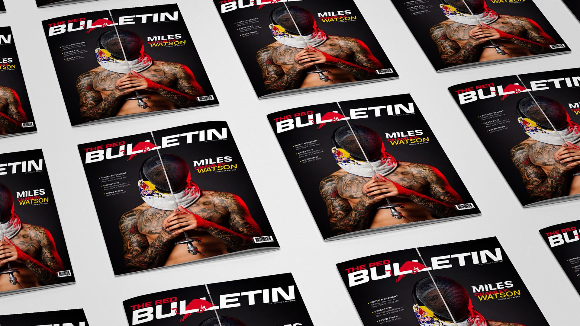
The Red Bulletin's masthead redesign uses dynamic typography and leaping bull imagery to capture the bold, adventurous spirit of athletes pushing their limits.
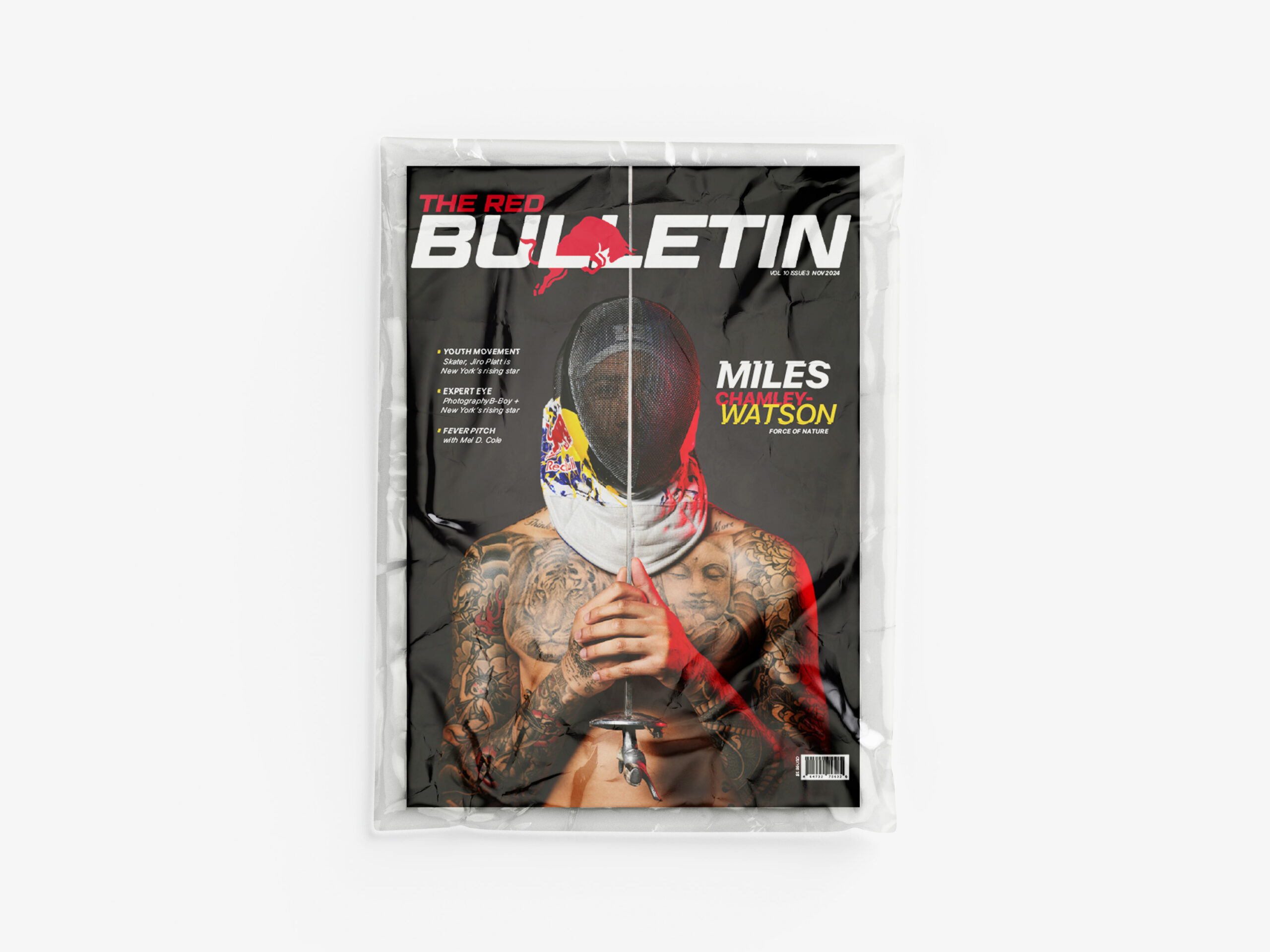
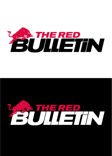
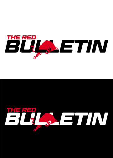
Redesigning the masthead allowed me to experiemnt with activating the bull. I used Red Bull's iconic beverage design to slant the type in the masthead to the same angle of the blue and silver slants on the can to evoke more movement. The 'I' was changed from a lower case to uppercase to bring the focus on the bull.
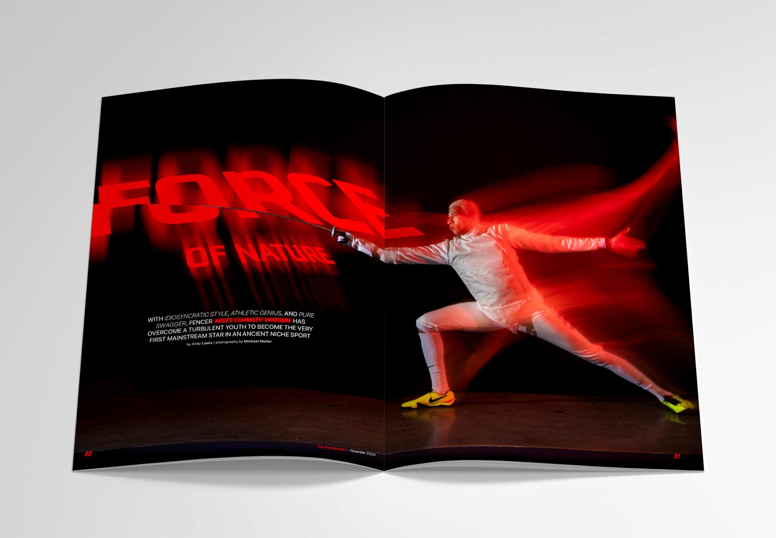
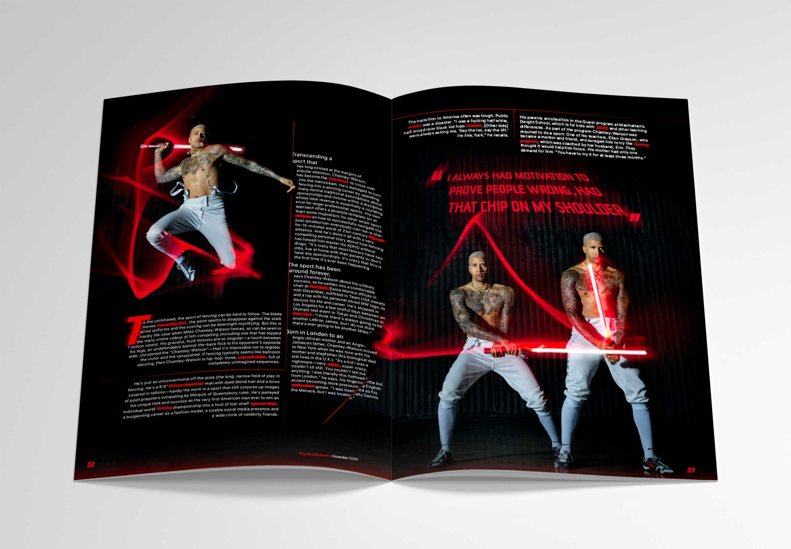
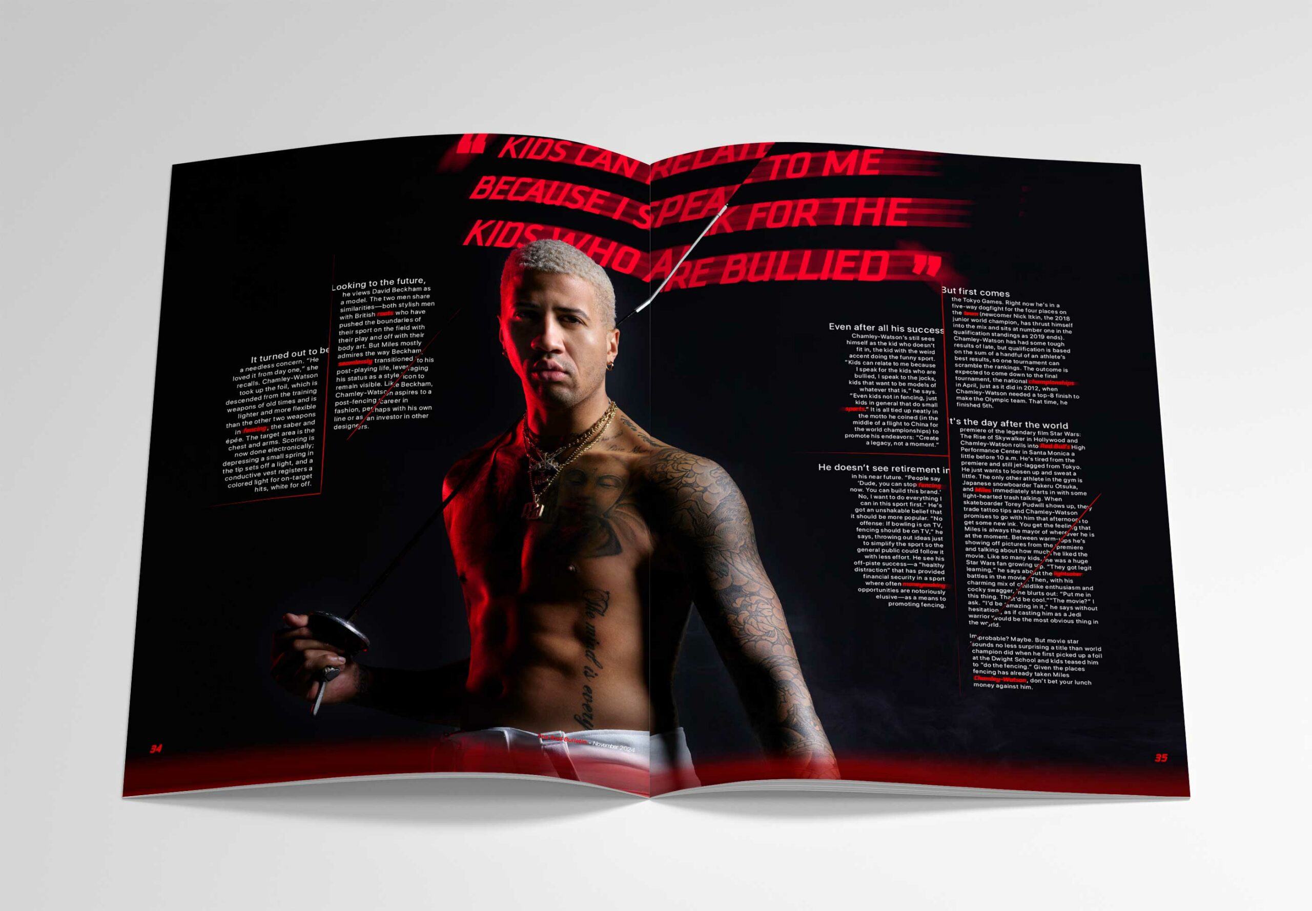
For my redesign of The Red Bulletin's masthead and three spread features, I wanted to capture the essence of adventure and the spirit of athletes who push the limits. The Red Bulletin's focus on extraordinary stories of individuals who break the mold inspired me to create a masthead that embodies motion and excitement.
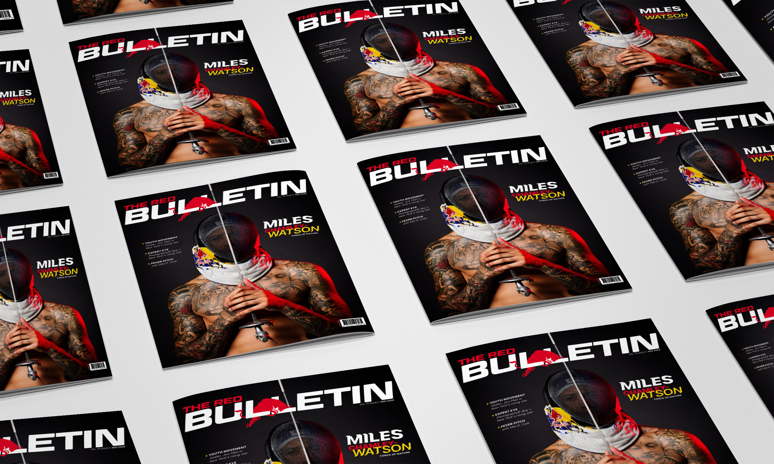
I ignited the iconic Red Bull emblem, transforming it into a leaping bull that bursts through the typography. This design choice adds a sense of energy and adventure, reinforcing the magazine's focus on bold, dynamic stories. I chose an all-caps typeface that mirrors the iconic slant of the Red Bull beverage can's design, providing a sense of speed and forward motion.
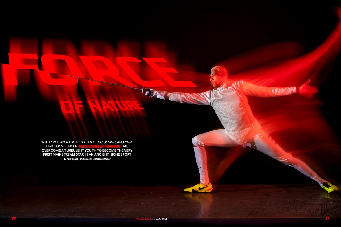
For the spread features, I incorporated photography by Michael Muller, which showcases long-exposure light trails and dynamic action. To complement the photography, I used typography that integrates seamlessly with the images, mimicking the light's fluidity and motion. By allowing the text to flow and interact with the light trails, the spreads achieve a sense of harmony and cohesion between the design elements and the photographs.

I also added subtle slices within the paragraph text to evoke the movement of a sword, reflecting the kinetic energy captured in the photoshoot. This technique brings a tactile dimension to the spreads and connects the typography with the physical action within the imagery.
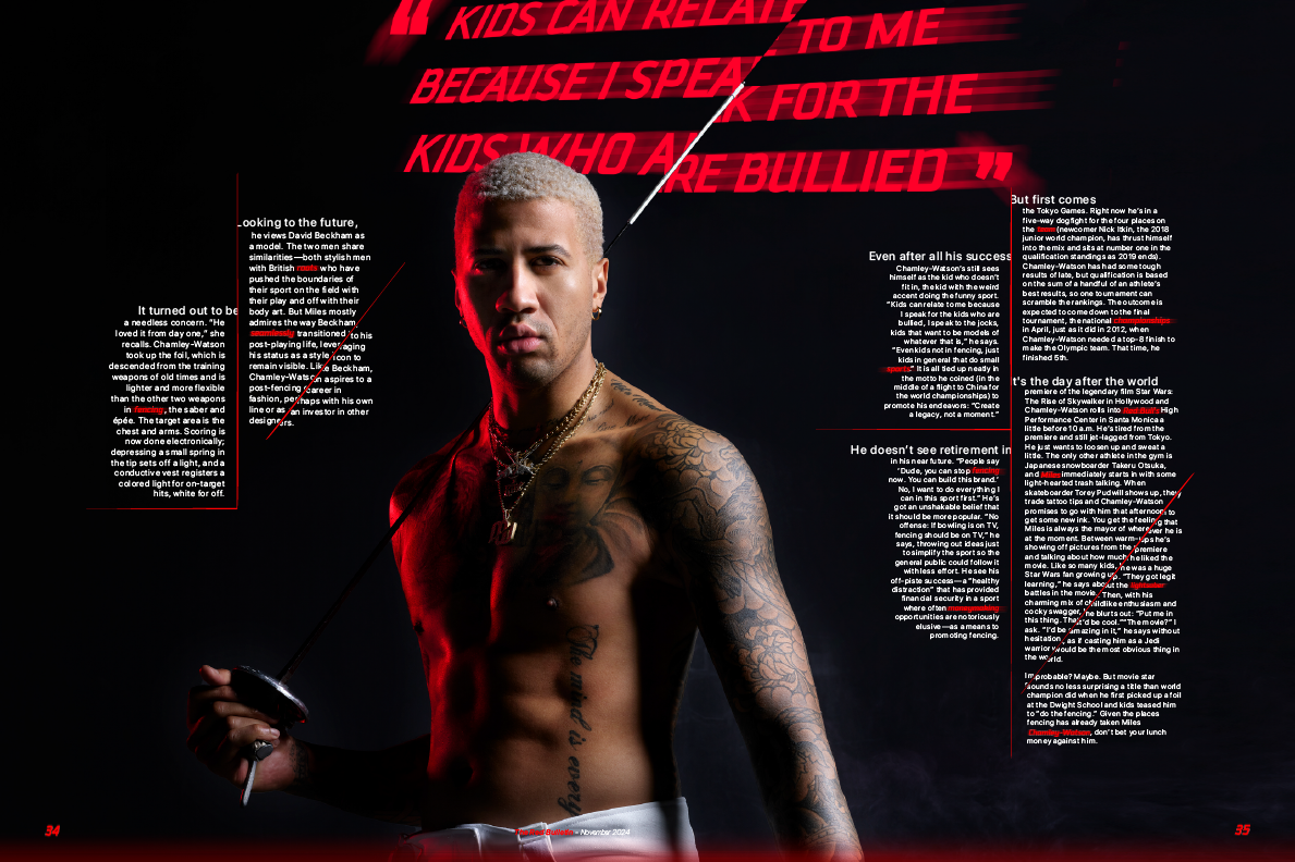
Overall, the redesign emphasizes a sense of adventure, motion, and boldness, aligning with The Red Bulletin's mission to showcase stories of remarkable achievements. By infusing energy into the masthead and spreads, the new design creates a visually engaging and inspiring experience for readers.
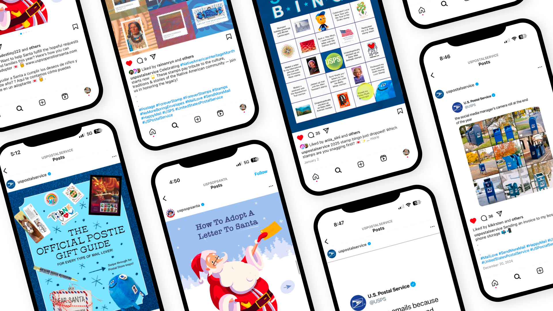
United States Postal ServiceProject type
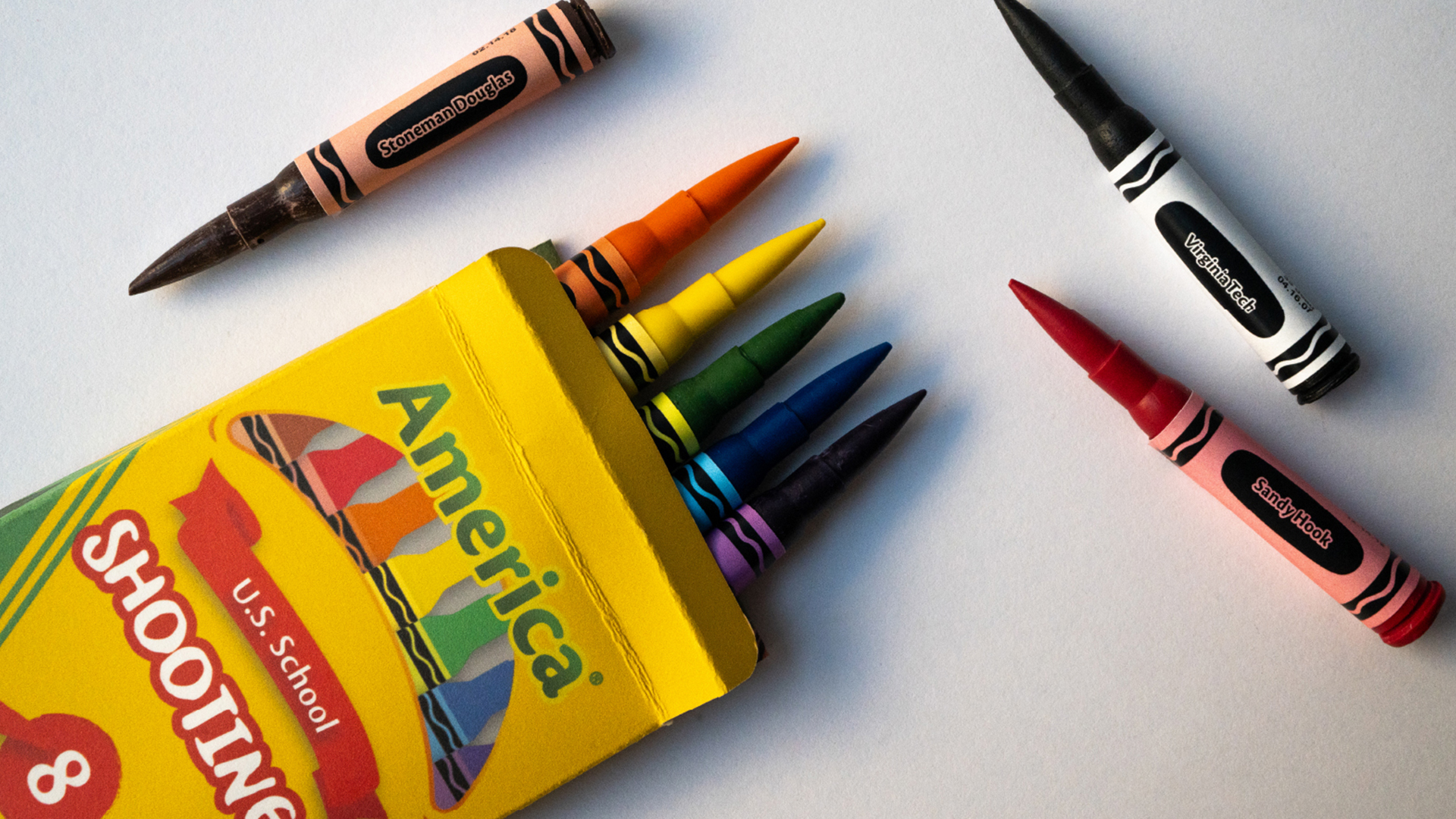
Coloring in AmericaProject type
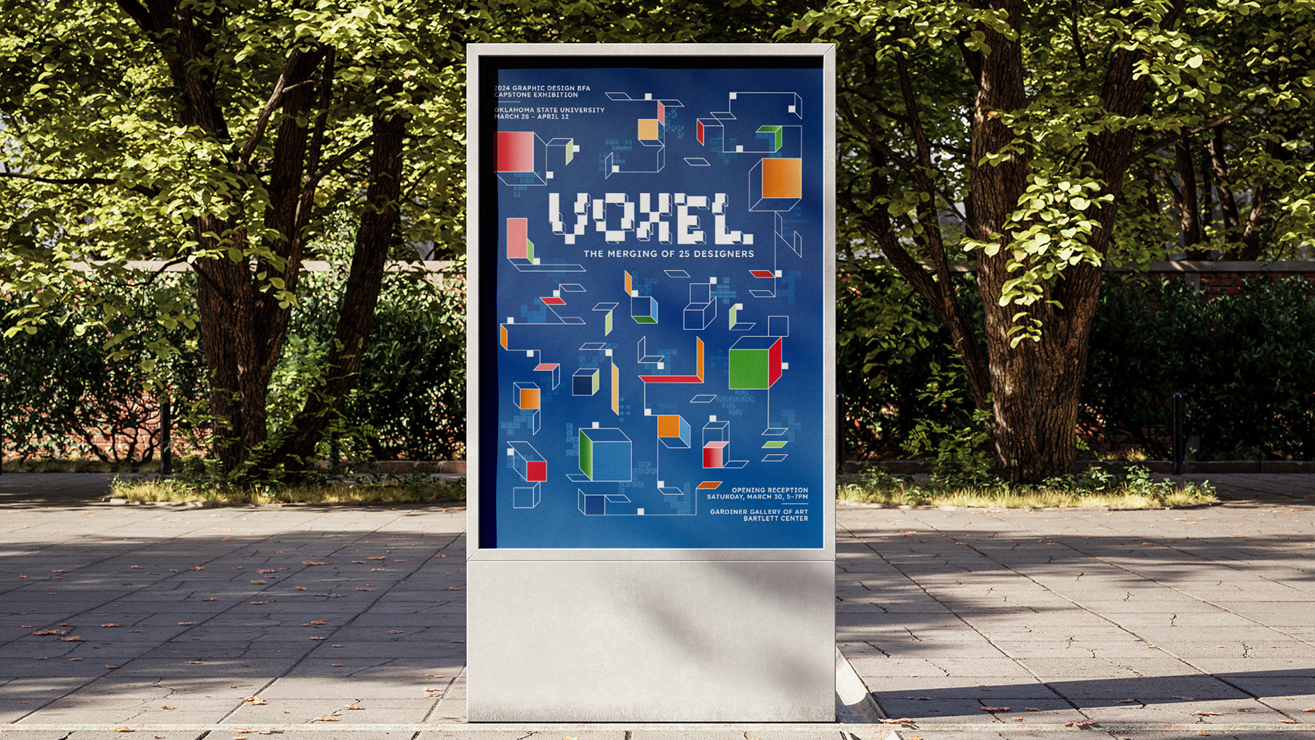
VoxelProject type
The Red BulletinProject type
Dust JacketsProject type
The ABC's of Female InventorsProject type

Bringing Shapes to LifeProject type
Betty BuzzProject type
Golden FlakeProject type
The Book of EliProject type
Typo RomaProject type
Alom DeeProject type